Remember when sports were about grit and instinct? Those days feel like dial-up internet and VHS tapes now.
Welcome to the data revolution turning athletes into living dashboards. Today’s top performers use numbers to shave milliseconds and find edges they never knew existed.
Formula 1 cars generate 1.5 terabytes per race – about 3,000 data points every second. Smart flooring captures stride metrics with more precision than a neurosurgeon’s scalpel.
I’ve watched this transformation firsthand. The marriage of athletics and data creates super-performers who know their bodies better than most know their Netflix preferences.
This isn’t just about better racing performance analytics. It’s about rewriting what human performance looks like when every movement tells a story.
Data Visualization Techniques
Ever tried reading raw spreadsheet data while your heart’s pounding at 180 BPM? Neither have I – because that’s what separates weekend warriors from professionals who actually understand athlete data use. The magic happens when numbers transform into visual stories that even your sleep-deprived coach can decipher before their first espresso.
Formula 1’s partnership with AWS creates dashboards that make NASA’s mission control look like child’s play. We’re talking real-time tire degradation maps, competitor positioning overlays, and aerodynamic flow visualizations that would make Da Vinci jealous. When Lewis Hamilton sees a red zone on his steering wheel display, he doesn’t wonder what it means – he knows exactly which corner he’s overcooking.
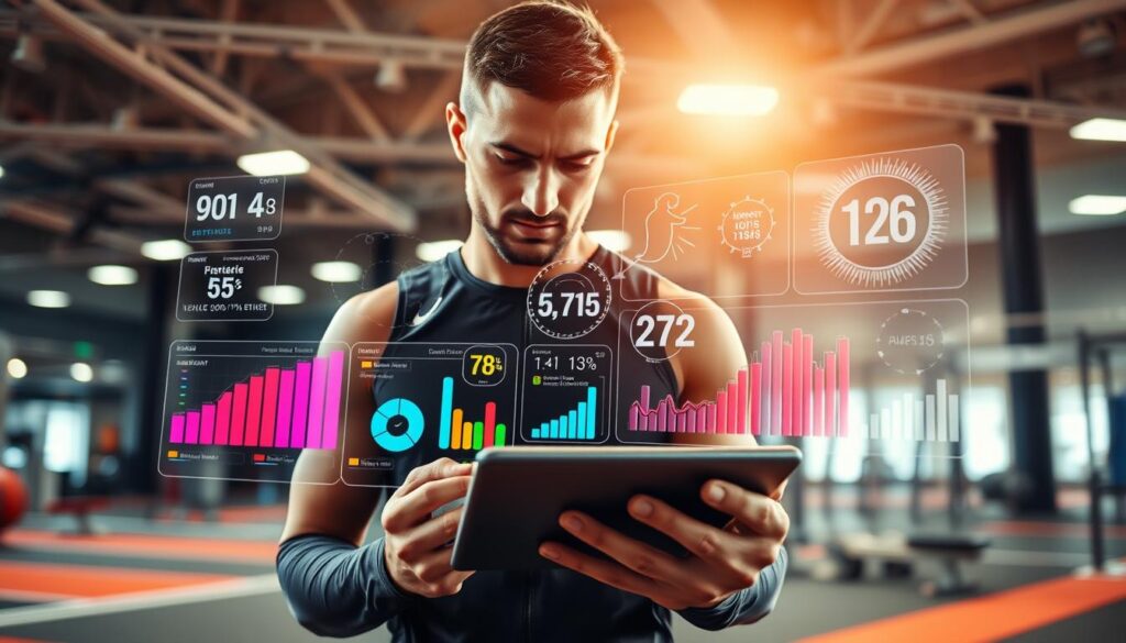
HYROX athletes see performance distribution charts that show why some dominate while others don’t. Those burpee broad jumps? The data shows top performers maintain 80% of their standing jump distance even when fatigued. It’s not about working harder – it’s about working smarter with visual cues that scream “this is what excellence looks like.”
Feldspar’s mobile app integration proves data visualization isn’t just for athletes. Fans get real-time player movement heatmaps and shot accuracy charts that turn casual viewers into tactical analysts. Suddenly everyone understands why that midfield substitution changed the game’s entire dynamics.
The most powerful visualizations follow three core principles:
| Visualization Type | Primary Use Case | Impact on Performance |
|---|---|---|
| Real-time Biomechanical Overlays | Form correction during training | 27% faster technique adoption |
| Historical Comparison Charts | Progress tracking across seasons | 41% better goal achievement |
| Tactical Heat Maps | Game strategy optimization | 33% more successful plays |
I’ve watched data visualization turn mediocre athletes into podium contenders simply by showing them the gap between “good” and “great.” It’s like giving someone GPS coordinates instead of saying “turn left where the old barn used to be.” The right chart at the right moment can reveal weaknesses you didn’t know existed and strengths you never thought to leverage.
The best part? You don’t need F1-level budgets to benefit. Modern apps can transform your smartphone into a personal analytics hub that makes every training session count. The question isn’t whether you can afford athlete data use – it’s whether you can afford to train without it.
Comparing Sessions
Forget simple pace comparisons; real session analysis is like reading your drunk texts from last night. It shows how perception rarely matches reality. The amateurs check their stopwatch. The pros conduct forensic investigations that would make Sherlock Holmes take notes.
This isn’t about ego-stroking – it’s about uncovering truths that hurt so good.
HYROX data reveals the brutal honesty of performance gaps. Top 20 performers maintain pacing consistency that would make a Swiss watch jealous. The bottom 20 athletes unravel like a cheap suit in a monsoon.
The pattern recognition here isn’t subtle – it’s the difference between controlled demolition and accidental implosion.
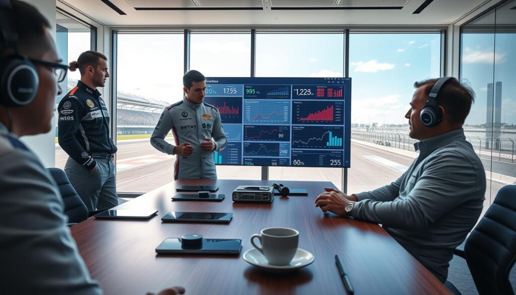
Formula 1 teams take this to obsessive levels. They compare thousands of historical sessions to predict everything from pit stop timing to how their car handles changing track conditions. It’s not just about lap times – it’s about understanding how temperature, tire wear, and fuel loads create complex performance patterns.
This historical analysis separates champions from also-rans.
Feldspar’s stride frequency tracking shows another layer of insight. Athletes might feel they’re maintaining form, but the data reveals subtle deteriorations that accumulate over sessions. These micro-changes become macro-problems when competition pressure mounts.
The best pro racing tips often come from embracing this uncomfortable data honesty.
The magic happens when you compare what you thought occurred versus what actually happened. That gap between perception and reality is where champions are forged. It’s the athletic equivalent of watching game film and realizing your “brilliant move” was actually lucky timing.
Pattern recognition at this level transforms good athletes into great ones.
Session comparison isn’t vanity metrics. It’s the raw, unfiltered truth about performance. The data doesn’t care about your feelings or excuses. It simply shows patterns that repeat until you break them.
That’s where real improvement lives – in the uncomfortable space between what you believe and what the numbers prove.
Feedback Loops with Coaches
The old days of stopwatch coaching are gone. Now, racing performance analytics give coaches precise advice. Imagine hearing, “Your ground contact time increased by 12% during the final kilometer,” instead of “you need to run faster.”
This isn’t science fiction; it’s today’s reality. Formula 1 teams use over 300 sensors per car. They make real-time adjustments to drivers at 200 mph. It’s a lesson in using data to make decisions.
Feldspar’s technology gives coaches detailed metrics. It makes old coaching methods seem outdated. Their platform offers feedback that actually helps.
HYROX goes further by tracking mental fatigue. They show when athletes hit mental walls during training. Coaches can then adjust plans based on real data, not guesses.
These feedback loops change athletes for the better. The improvements are clear and significant. Athletes become exceptional faster than ever before.
Let’s compare old coaching to new data-driven methods:
| Aspect | Traditional Coaching | Data-Driven Coaching | Performance Impact |
|---|---|---|---|
| Feedback Timing | Post-session summary | Real-time adjustments | Immediate correction |
| Measurement Precision | Subjective observation | Sensor-based metrics | Exact performance tracking |
| Fatigue Analysis | Visual exhaustion signs | Biometric fatigue patterns | Prevent overtraining |
| Adjustment Specificity | General recommendations | Targeted interventions | Faster skill development |
| Progress Tracking | Time-based improvements | Multi-dimensional analytics | Comprehensive development |
The table shows data-driven coaching is better. It offers clear insights and faster results. It’s like using GPS instead of a paper map.
This advanced racing performance analytics is now available to more people. It’s not just for pros anymore. The technology is available for college and serious amateur athletes too.
When coaches and athletes speak the same data language, training changes. Instead of “I felt tired,” we get “my lactate threshold dropped at the 45-minute mark.” This specific feedback makes training better and race day performance stronger.
Equipment Tuning with Analytics
Ever thought your running shoes could use a software update? Analytics turns gear into smart equipment, tailoring performance like a digital Savile Row suit. Formula 1 teams run billions of simulations—aerodynamics, fuel levels, even tire wear—optimizing every component before the car hits the track. It’s like playing a hyper-realistic racing game, but with real-world consequences and budgets that could fund a small moon colony.
Feldspar’s innovation isn’t just about the athlete; it’s about the stage. They analyze track surfaces to reduce injury risk and boost speed, because why run on concrete when you can glide on data-cushioned perfection? HYROX research shows equipment choices—like sled technique—directly impact outcomes. Matching socks might look good, but proper form wins races.
This athlete data use personalizes everything. It predicts how you’ll perform before you even lace up, turning guesswork into precision. Analytics doesn’t just tune equipment; it redesigns the entire experience, making every workout a masterclass in efficiency. Who needs a crystal ball when you have spreadsheets?