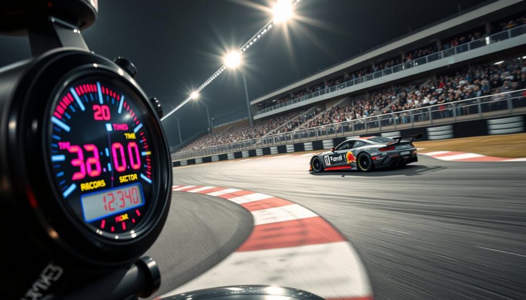
Ever wonder how those magical numbers appear on your screen during a race? It’s not wizardry – it’s science with a side of engineering genius.
Professional timing systems turn raw speed data into useful metrics. It’s like a digital stopwatch on steroids. It tracks vehicles through START/FINISH beams and strategic split points.
To really analyze lap times, you need to know what’s happening behind the scenes. The foundation is key, more than you might think.
It’s like learning grammar before writing poetry – except this poetry smells like gasoline and sounds like screaming tires.
Understanding Sectors & Splits
Welcome to the world of race analysis, where we examine performance data like detectives at a crime scene. The focus is on your race performance. Split times reveal more than any photo can.
I’ve spent countless hours studying Strava data, like a digital archaeologist. My goal is to find valuable split information from experienced runners. It’s like discovering the Rosetta Stone of racing.
By studying enough data, we find smart racing patterns. Winners often start conservatively and maintain a steady effort. It’s like the story of the tortoise and the hare, but with more sweat and heart rate monitors.
Averaging data from multiple runners is key:
- It accounts for unexpected breaks, like using a portable toilet
- It smooths out variables like sudden storms or enthusiastic fans
- It gives a realistic benchmark for the course
- It helps spot consistent patterns, not just one-off performances
When GPS watches fail mid-race, we find ways to get split data. We use timing mats, photographer timestamps, and math to do it.
Being a detective in a race course is exciting. The evidence is sweat, heart rate data, and gel wrappers. The reward is real split time improvement that makes your racing strategy better.
This method of analyzing sectors leads to split time improvement that simple finish times can’t show. It’s the difference between knowing you ran well and understanding why.
The data is clear, but it needs the right person to interpret it. This interpretation leads to split time improvement strategies that work in different races and courses.
Tools for Analysis
Welcome to our digital detective agency. Here, your GPS data is the key clue. We use Strava like it’s a top-secret tool for athletes. Most see it as a digital trophy, but we turn it into a lab.
Topographic maps are our secret weapon. CalTopo makes Google Maps look simple. It shows why some runs feel tough. Your legs know the elevation changes, but your brain doesn’t.

Heart rate data tells us more than we want to know. That drop in heart rate at mile 18? It’s not just fatigue. It’s your body screaming for food while your brain thinks you’re on top of the world.
My trick is to freeze time charts with a left-click. It’s like pausing a video. This lets you compare splits easily, without getting lost.
Three essential racing time tips for data mining:
- Sync Strava with topographic overlays – see the invisible hills
- Flag heart rate anomalies – they’re usually aid station markers
- Manual split recording – because auto-splits can be dirtier than a cross-country course
When you use these tools together, magic happens. Topo maps show the terrain, heart rate data tells us secrets, and manual splits keep things real. It’s like having a triple lock on your performance data.
Data doesn’t lie, but it needs someone to understand it. You’re that person, turning numbers into tips for faster times. Knowledge isn’t just power; it’s speed.
Interpretation Tips
Ever tried wearing someone else’s racing splits? It’s as uncomfortable as wearing their underwear. The real challenge in performance analysis is knowing what to do with the numbers.
Proportional adjustment is key. It’s like translating race splits into your own language. This skill sets you apart from just collecting data.
Imagine aiming for a 10-hour finish at San Juan Solstice, but your training partner’s splits are for an 8:30 finish. The amateur might try to match their pace. But the pro uses proportional adjustment.
Here’s the math:
- Divide your goal time by their actual time
- Multiply each of their splits by that ratio
- Now, their splits are your realistic targets
A 5% adjustment might seem small. But on the course, it’s huge. It can mean the difference between winning and not finishing.
At last year’s San Juan Solstice, some runners followed elite splits too closely. They crashed by mile 40. But those who adjusted their splits wisely finished strong. The numbers prove it, even when your ego doesn’t.
| Split Type | Elite Runner | Your Adjusted | Time Difference |
|---|---|---|---|
| First 10M | 1:15:00 | 1:25:00 | +10:00 |
| Middle 20M | 2:30:00 | 2:50:00 | +20:00 |
| Final 20M | 2:45:00 | 3:10:00 | +25:00 |
| Total | 6:30:00 | 7:25:00 | +55:00 |
This table shows how adjusting splits helps with pacing. Notice how the time differences grow later in the race? That’s to account for getting tired while staying competitive.
This method turns someone else’s splits into your own roadmap. It’s why racing performance analysis is key to success.
The goal is to run your best race, not someone else’s. Use their data as inspiration, not a rule. Your splits should fit you perfectly, like your favorite running shorts.
Using Data for Practice Planning
Raw numbers turn into smart training when you use them right. Your analyzed splits should guide your workouts, not just look good on paper.
Create pace charts that show your real speed, not your dreams. These charts are your guide, telling you when to go hard and when to save energy.
Tools like RACE RESULT 12 make data useful for training. They help plan your intervals to match race conditions closely.
When you use data to improve, it changes your training. This data-driven racing makes you faster in real races.